A Bit of a Shock: A Deep Dive into Bolt’s Rebrand and Web Design Overhaul
Our web design expert, Elwyn Davies, explores the transformative power of rebranding in web design.
As a web designer, I've always been fascinated when a brand reinvents itself. I can’t help but have the following questions rattling around in my head:
Was it needed in the first place?
Was the rebrand a small step or a giant leap?
How will customers take to it?
Sometimes, it is not just about changing a logo or tweaking a colour scheme but also embodying a new identity that resonates with as many visitors as possible.
Today, I'm diving into a case study for a project that I have enjoyed following over the past few months - the rebranding journey of Bolt.
This organization's shift to an electric yellow palette and the project tagline "A shockingly simple rebrand" has not just turned heads with a well-placed pun but has stirred conversations in the design world.
But has it delivered?
Let's rewind a bit…
Before this seismic shift, Bolt embraced a cobalt, black, and grey colour scheme — professional, yes, but perhaps too safe. The transformation to bold and striking hues marks a significant departure from the norm, both brave and commendable. As we peel back the layers of this rebrand, we'll see how it's not just about aesthetics but about making a statement, daring to stand out, and, most importantly, aligning the visual identity with the brand's evolving narrative.
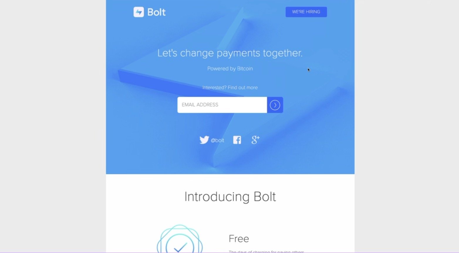
The very first Bolt website iteration
"Rebranding should never be just a visual makeover; unless you want to miss out on the true benefit. Instead, it should be about aligning your identity with your evolving story and values."
- Elwyn Davies, Pixelhaze
The Evolution of Web Design Aesthetics
Web design trends have evolved drastically, from glossy buttons and thin fonts to bold typography and immersive experiences. The shift reflects a broader change in how brands communicate — from mere information dissemination to creating memorable, impactful interactions. As I explored the earlier versions of Bolt's website, it was evident that while they were professionally designed, they lacked the character and boldness the brand aspired to embody.

A clear development to this 2020 iteration
The Impact of Colour Psychology
Colour is both an aesthetic and a psychological choice. Bolt's transition to electric yellow isn't arbitrary. This hue is known for its attention-grabbing qualities and is often associated with energy and innovation. It's a strategic move, signalling a dynamic and forward-thinking brand. As I navigated through the new site, using yellow as an impact colour, sparingly yet effectively, demonstrated a masterful understanding of colour psychology.
"Sometimes, what is seen as an innocuous choice of changing the colour can elevate a brand from being just seen to being truly memorable."
- Elwyn Davies
Takeaway Points:
A successful rebrand aligns with the brand's evolving story and values.
The evolution of web design reflects a shift towards creating impactful user experiences.
Strategic use of colour can significantly influence brand perception and user engagement.
Minor design elements, like typography and spacing, contribute to the overall narrative.

Bolt’s 2023 website design takes a bold, brave leap in a new direction.
Wrap-up
A rebrand can sometimes be a facelift; sometimes, it is a strategic move that flows across all website pages and sections. This re-brand firmly fits within the latter. From the bold leap to electric yellow to the subtle nuances of typography and layout, Bolt's journey is a testament to the power of thoughtful design and the human (designer) condition where the project is never considered truly finished.
As we continue to explore and analyze such transformations, it's clear that the key to a successful rebrand lies in its ability to look different AND feel different to resonate with users on a deeper level. So, what's your take on Bolt's rebrand?
Do you think they've captured lightning in a bottle (I’ll groan on your behalf!)?
Let's keep the conversation going…