A Guide to Squarespace Lists
A hidden, yet very useful feature of Squarespace. The ‘List’ content section allows for additional functionality to your website without the need for complex code.
A beginner Squarespace tutorial introducing the new Squarespace lists feature.
Squarespace is a great website builder, and it is even better with the flexible new Squarespace lists feature. Today we are going to be looking at Squarespace lists, how they stack up against summary blocks, how and when you can use this new feature, and we'll also show you a few visual examples.
When creating a website, I will often begin by creating a wireframe on my chalkboard or sketch pad, design the layout, then, once I'm in Squarespace, I will add in a new blank page and section. From this blank section, I will then try to build the concept I've created using different content blocks. Although this is usually the correct way to approach building websites, In doing this, I have missed a few secret features of Squarespace, which are quite well hidden.
The challenge of starting with a blank template is that templates cannot be replicated. Myself and the PixelHaze team have always run into issues where we wanted a sliding banner to function in a certain way, but have had to painstakingly code this functionality using our own custom CSS. This can be quite a nightmare, as you can imagine. Even our lead developer, Will, often struggles to create some of these elements with just CSS. We created our own bespoke sliding banner here at www.wyeside.co.uk So when we discovered this secret feature of Squarespace, we were kicking ourselves.

Bespoke Sliding Banner creating using CSS & Gallery Blocks

Select ‘List’
Where can I find the lists?
This feature can be found by going on to any of your pages, adding in a new section, then finding the item called 'lists'. In the list section, there are a number of different formats, which can be handy in many different scenarios. This feature is only available in Squarespace 7.1. There are three main list formats, these being simple list, banner, format, and carousel. The main list format we've been using currently is the circular list format, also known as the simple list format.

By hovering over your new list section, you have two options. You can either edit it like a normal content block or edit the content. If I select edit content, there are a number of different functions which allow you to edit all the nitty-gritty features of how the images are displayed, how they're cropped, how many are shown, and the most important aspect of the list feature - the slide banner. The slide banner allows you to put a number of items into a section as if it were a gallery, but it has slightly different functionality.

List - Sliding Banner
Banner Slideshow

Select from 3 different styles
The slide banner allows me to add in a number of different columns to display, for example, a series of reviews for a restaurant. I can also crop the images. In a gallery, or in a usual image, you can crop the image into a variety of different squares or rectangles, depending on your preference. But one of the key features of lists is that you can actually crop your images into circles. This was a feature we thought was only possible with custom CSS, we created our very own Cookie Cutter plugin, which allows you to crop an image to whatever shape you like. But having this circular option is incredibly useful. View the Cookie Cutter Plugin here.
Having only discovered this hidden feature a month ago, I've been using it regularly and on a lot of the new websites, I've been designing. Some of the functions I've used this for include reviews for a client, so clients can list all the positive reviews they've had for their services or products, allowing you to show a number of reviews without completely cluttering up your homepage.

Simple List - Reviews
Simple List
Once you edit the list section, you can have a number of different cards, which you can then use the arrows to flick through each individual card. There's also an option to select an infinite scroll which means once you've reached all five or six of your reviews, it'll go straight back to the beginning, landing the user where they began. I have also used this list section in our very own PixelHaze store. If you go to our Squarespace templates, you'll be able to see that I've used this feature to create a simple, one, two, three format, which explains to our users what exactly Squarespace templates are and how they can give you the edge over your competitor’s sites.
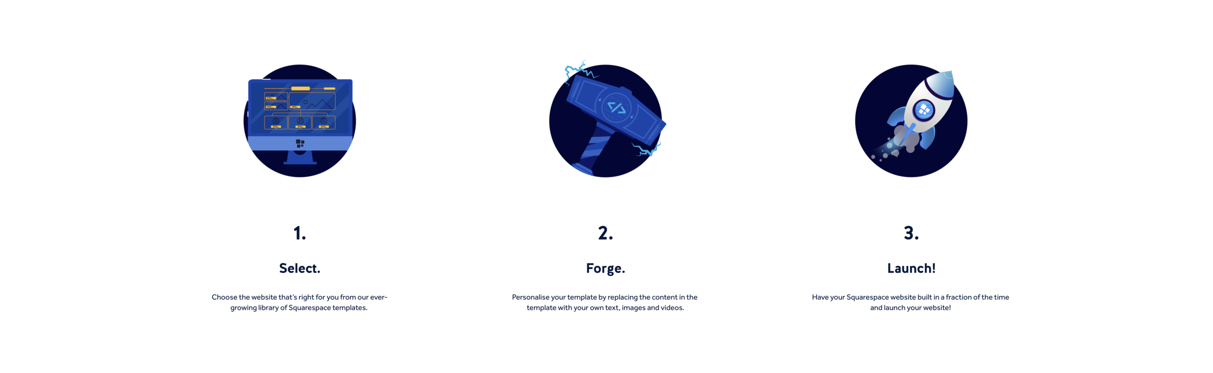
Simple List - Step by step guide (PixelHaze Store)
There are three individual cards in here with their own descriptions and, with the use of some additional custom CSS just to achieve different text sizes. I could easily add more steps if needed.
Prior to learning about this feature, I would usually create this layout by creating three separate image blocks, along with text blocks corresponding underneath. However, this can become quite messy due to Squarespace's 12 column grid with different items snapping into the wrong sections. By using the list section, it makes the whole process so much easier and allows me to scale and size the section to my will. This makes the site look professional and saves so much time.
I’ve created an example of how I used to create this 3 space split below:

Step 1

Step 2

Step 3
I've recently used this section inside of a gallery at the top of the main landing page. Not knowing about this feature prior, we had to painstakingly code an animated banner that flicked through the different sections of 'what's on' for previous clients in the past. Examples of this include Wyeside where we had the newsfeed filtering into a scrolling banner, which automatically transitioned over time, that was using a gallery section rather than a list.
Had this list functionality been introduced prior it would have saved us a lot of time and money on that particular project! This is because the feature allows you to have your own background section, or an image behind along with a card that sits comfortably on top of the image where you can put whatever text or header you would like. This can be edited a lot easier than our custom CSS solution, which would require the user to go into the CSS to edit it.
I've only scratched the surface of what's possible to create with list sections in Squarespace website design. I'll definitely be using this feature a lot in future for a number of different functionalities. I look forward to seeing how you use this feature.
If you have any questions about how we use this feature in any of our websites or want to know the next steps to adding style to your site, please drop us a message here:
If you’re interested in seeing how we’ve used ‘list’ section banners in our Squarespace websites, head over to our Squarespace template shop at www.pixelhaze.store.
Lorem ipsum dolor sit amet, consectetur adipiscing elit. Vestibulum id ligula porta felis euismod semper.