The Ultimate Beginner's Guide to Squarespace
2024 Update!
The fluid engine revolutionised Squarespace after the much-publicised launch in 2022, making website design more intuitive, faster, and smoother.
With the fluid engine, creating a stunning website has never been easier. No more worrying about complex coding or spending hours on design when you can drag and drop elements into place. The best part? Getting started on Squarespace has never been easier. With free tutorials and blogs, anyone can easily learn how to design a professional website. Plus, for those looking to become Squarespace designers, the new Moonshot series launching in May 2023 provides a definitive course that covers everything from basic to advanced Squarespace design techniques. And yes, that will be featuring the Squarespace Fluid Engine!
Need hands-on Squarespace support and assistance? Join our Skool community.
Now, back to the original Squarespace for Beginners article….
Buckle up, newbies! We're going to hit the rewind button, go back to the very beginning, and look at how we can develop a quick and simple website using the basics within Squarespace. This is the Ultimate Beginner’s Guide to Squarespace.
“I want to tap into the ten years I’ve had working with Squarespace, creating over 500 websites, and 3000-4000 websites over my 20 years in the web design industry”
This tutorial will show you how you can get the foundations right in designing your website to ensure that you're not making simple mistakes that could cost you in the long run.
We're going to create a new trial in Squarespace, strip it right back to the bare bones, and then build out the scaffolding that you can get up and running along the right lines.
Pick the right gear
To get us up and running, we first need to make sure we're selecting the right equipment for the website design job at hand. Using an analogy I like to use regularly - which car model do we need? There are three options:
1) Family hatchback
The reliable, easiest to learn of the three different vehicles. You don't need an advanced license to be able to get yourself from A to B. This is where our website builders fit in really nicely.
2) Custom-fitted high-performance sports car
This is still a car you're able to use on the road, it allows a degree of flexibility, and you don't need to be an expert racing driver to be able to handle it. But at the same time, there are pitfalls, and there are things that you need to be mindful of when getting behind the wheel. This middle option would be akin to software like WordPress, although you can pick a template and keep it very simple, the moment you start modifying WordPress, it can be more complicated to use.
3) Elite performance Formula One car
At the other end of the spectrum is the elite performance car comparable to how leading agencies will deliver projects. You can expect elite performance in a very competitive market, but the flip side is you're paying for that benefit.
Option 1 - Website Builders
These are the simplest and the difficulty will scale with you. We're going to use Squarespace in this example. What you'll find on Squarespace is there's a huge list of tools in the toolkit, features that allow you to build up your pages with lots of flexibility, which is a massive selling point for good website builders. You'll find everything under the hood; where Squarespace will keep control of aspects like the hosting, management of domain names, and lots of other technical requirements like making sure you've got an SSL certificate active so you have a secure website, this all happens within Squarespace directly and without you needing any sort of technical understanding.
Option 2 - Custom Builds
We're going to use WordPress as our example here. There's a huge array of options in terms of how you can customize the look and feel of the website. You can pick the starting template on WordPress and that works in many cases, but you can also build the website from scratch using custom code and ensure that you get the bespoke look and feel that you're after.
WordPress is capable of managing huge websites. Whereas I would recommend a Squarespace website of up to around 1000 to 2000 pages in total, WordPress can manage more. This number of pages sounds like a lot, but if you're in a large organization in a high-growth competitive sector, you may need more pages. You will then have a website that's capable of plugging in various custom code that's been created by a very active community, so it becomes a tinkerer's paradise!
You can learn on the platform and there's a huge range of flexibility. But the cost is the fact that you have to know enough to be able to manage it or have someone in to manage your website for you to make sure you're not making any fatal mistakes.
Option 3 - Agencies
With agencies, you can 100% expect the best results. You are speaking to experts which can have collectively many many years of industry experience and they will be comfortable dealing with large organizations with very demanding requirements. On the flip side, you can probably guess you're going to have to pay and pay a considerable amount for a good agency. So it depends on the size of your wallet, and also how much time you've got available.


This starting tutorial on Squarespace is geared for those who are time rich, but at the moment cash poor, or can't justify spending a huge amount on having someone to build a website for them. You can get an awful lot from Squarespace, especially if you put the time in at this early stage. So without any further ado, let's have a play with the platform.
Getting started in Squarespace
Now we're going to create our website in Squarespace. If this is your first time, you'll need to create an account from scratch, by following the form instructions. I already have an account, so I'm going to click on the get started button and jump into the process of choosing a template.

Squarespace has a wide variety of starting templates to choose from
Scroll down the page and check out the various templates Squarespace has to offer. One thing with Squarespace 7.1 (the latest version), the template you choose isn't as important as it used to be, because many of these templates if not all of them have lots of interchangeable features, meaning that there's a huge similarity across different templates. One thing that might change is the masthead. Some templates have very specific options in the masthead, but even then most are very similar.
The best way and the way I'd recommend is just to jump in and have a go. So I'm just going to choose a template to get me started, I picked Barbosa. You can preview it, just to see how the website looks before choosing that template. If I scroll down through smoothly, we can see that there are nice image transitions, good contrasts between the text and the background, and a little bit of banding between the image and the call to action band - so all in all, nice little template to start with.
“One of the true strengths of Squarespace, in my opinion, is the quality of the templates themselves.”
We can also preview it to see how it will look on both tablet and mobile design, as well. When we are building a website using Squarespace, a good thing for your peace of mind is that the mobile layouts are already built for you, so you don't have to then go and build a separate app or mobile-friendly website alongside this.
Once you've decided on the template, click 'Start with this design' and it will then take a few seconds just to get everything set up for me. I can now enter in a website name and it will then take you through the tutorials, giving you an idea of where to find things.

Take some time to look through the tutorials and get used to using Squarespace
If it's your first time, have a look through this and just absorb the general flow of the website. When you’re ready, click on 'Get Started'. We can now see there's a menu on the left-hand side. We're going to be focusing predominantly on the 'Pages' section. We also have our content area on the right-hand side. This is a WYSIWYG editor - What You See Is What You Get. We can have regular live previews as we're editing the website, which is crucial when you are new to web design.

The menu area is on the left and the content area on the right
Setting up
The first step is to get rid of any extra pages that you don't need. You can do this by clicking the trash can on the left of the page title and clicking confirm. You can activate the demo pages by clicking on the cog icon or the page title. Using the demos means you can use the page layout that's already in place.

Add the home page to the menu by dragging the page from the ‘Not Linked’ section to the ‘Main Navigation’ section. You can delete extra pages by clicking the trash can icon.
One thing we can see in this case is that the home page is not on the main menu. I know when we click on the title of the website, or the logo, if one has been uploaded, it will take us back to the homepage. But I'm a big believer in trying to remove as many barriers for the end-user as possible. If your user is thinking about how they navigate through the website, and where to find the homepage, then they're probably doing too much thinking. This means that there is not enough focus on the product or service that you're looking to portray.
So, a strong recommendation is to have the home on the top menu. To do this, all you need to do is click and drag the page from the bottom ('Not Linked' section) to the top ('Main Navigation' section).
Designing Our first section
Click on your homepage and click edit. When you do this, it goes to full-screen preview and when you roll over various sections in Squarespace, you see these blue pop-ups. So you can either add a section or edit the content on the page itself. I'm going to delete a few of these sections to neaten up the page but still leave in some content.

There are plenty of section options and templates to choose from
Next up, click on 'Add Section' and you can see the series of template section options that we can add. This is a huge step forward with Squarespace and it allows us to do an awful lot in a short space of time. I really like this feature from a scaffolding perspective, I can build up a page, one section at a time. For example, when we're building a quick turnaround one-day web design workshop, we will stick to the starter templates, because we don't have time to really customize the sections.
We picked the first Headline section option. We can see that the image has gone full width with the masthead overlaying it and we've got a title then centrally aligned, so we could put a welcome message in place in that area. Next, if I hover over the new header area, we should see a pencil icon, so click on that and we'll get a series of section options. I can change the height of the section from the preset options of small, medium, and large. The large, in most cases, will fill the height of the browser window, meaning we get that full background image. If I click on the three dots, I can manually adjust the height of the section.
The only downside to manual section heights is it does mean more time because we want consistency with the heights on our pages. We can get away with it on the homepage, but the majority of the time, we want these heights to be consistent from page to page because it helps with the user flow. We don’t want our users thinking about navigating through the website.

Clicking the pencil icon takes us to the format menu where we can adjust the section, height, width and alignment
For this example, I'm going to set a medium content height. In the content width, we can set small, medium, or large again, but because the text is aligned, it doesn't make any difference. Changing the content width changes the size of the blue rectangle around the text block.
We've also got the option to align the content to the top or bottom of the container with some preset padding around the text area.
We can also align it to the left, and this is where the content width comes into play. If we go with a large content width, we can see that actually, it's filling the width of the section so we don't need to align the content. So if I go with small and left-aligned, we can see that that text block now is aligned to the left. If I wanted the text to also be left-aligned, I would need to click on the alignment option above the text itself.
So now we've aligned our text block to the base of the image, with some clean padding below, and aligned the text to the left, meaning that we've got that consistency of the text aligned to the left all the way through.
Adding images to the header
My final step here in this header section is to remove the stock image and click on the plus button to add a new image. There are three options.
1) Upload a file from your computer.
2) Select from a library of pre-uploaded photos. This is really handy when you have an established website and you have a back catalog of images that you want to choose from,
3) Free or paid stock library images. The free images come from Unsplash where you can use photos from this community royalty-free and without cost. If you wanted to choose something more specific, or in some instances higher quality, you can choose images from Getty using the premium images option, but beware you will pay for this option. Here, we have an £8 option, (the currency will change depending on the location of your Squarespace account).
Choose a photo you want to use. I chose one with a nice dark overlay and it will take a few seconds to upload to the banner area. I can click, hold and drag the focal point to choose the area of the photo I want to appear. Now, as it happens, we've got a nice balance with the logo or text appearing clearly above the top of the image and a nice flow.

Adjusting the overlay opacity
I can adjust the overlay opacity via the 'Background' tab. The color that will cover the image when you turn up the overlay opacity will depend on the color pack that you've chosen. To change the color pack, click on the 'Colors' tab. In our example, it's set to darkest. If I was to select ‘Bright 1’, we can see it goes with a white overlay. There's no right or wrong here, apart from the fact that we need to make sure we get good strong contrast between our text and our background image. Have a play!
A poor example was clicking 'Light 2' as it completely washed out the text and image, which isn't very good for website usability. I'm going to choose 'Darkest 1'.
I'm now going to add a section with a white background for an introductory text area. Click 'Add Section' and the 'Text' option, selecting a suitable template. After adding this section, it doesn't look too great, we are losing a little bit of flow and consistency through our page. To make this look better, we clicked the pencil icon again, reduced the section height, aligned the section to the left, and aligned the text to the left as well. Finally, we changed the color pack to 'Light 1'.
What we've got now is a really nice sharp contrast between the hero unit or the banner at the top of the page and the text area below. I like to have a really nice contrast between sections.
How to manipulate content in sections
By hovering over a section, we can now see a blue rectangle outlining the height and width of the section. Because the full width is within the bounds of this blue rectangle, we're going to have some area unused. This is great if we're only using text to help make a bold statement in the section of a page. But ultimately, when we're looking at multiple columns, and if we had an image that will create another column, we might want to just bump up that width to large.
Now we can click on this plus icon in the oval and add an image. Initially, it will look enormous, but don't panic, we can adjust this quite easily. Choose an image and wait for it to upload. Now click, hold and drag the image and move it to one side. We can see that it now sits next to the text.

Adjusting the image size by holding and dragging the faint line between the sections
So with the mouse button pressed down, I can click, hold and drag an image. To start off with we got this huge blue box, if I was to release it at this point, it wouldn't move anywhere. I could move it above and we can see a long horizontal blue line, which would move the image above the text. I can move it to the left, where we can see the long vertical blue line that would split this container into two columns. Once we've done this, I can click hold and drag on the faint line between the sections to readjust.
You can see that it's snapping at various points, which is the 12-column grid in action. There are 12 columns that are invisible going across this page and we can snap our images to individual sizes. I can also drag it to the right and create two columns that way. Or I could hold and drag and you can see the small blue box which means that the text will wrap around the image. Once we've got the content in as we want, we can then choose the size of the image and fit it in as we want.
So those are a lot of the standard text editing options available. If I click on this oval again, we get a huge quantity of content options. We don't have time in this introductory section to cover them in detail. If you're interested in learning more, you can sign up for the Squarespace Box of Tricks course, which is available on PixelHaze Academy or on Udemy. This will take you through all of these options available in a huge amount of detail which is well worth checking out if you're new to Squarespace.
In our example, we've added a quote block. Now we have our welcome banner, we have our introductory section (which is probably a little bit too long for a section in its entirety) and we've got an image with some signposting and two more quotes below. So that's just an idea of how we can build out a page in Squarespace.
More handy hints
Mobile preview:
When we are in 'Edit' mode, in the top right corner, we have a mobile preview option. This allows us to flick between desktop and mobile views.
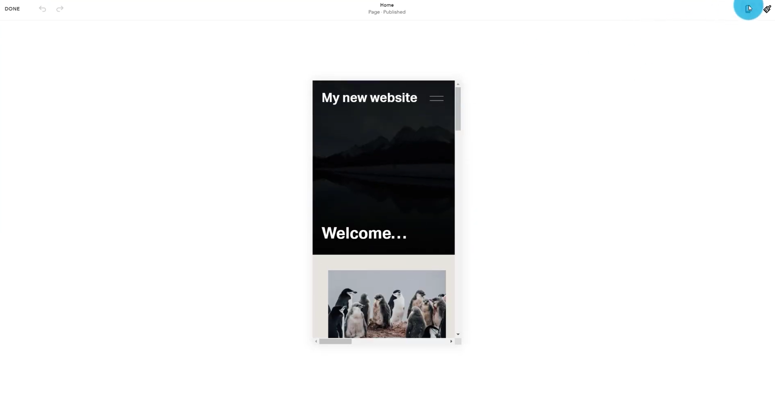
Site styles:
If you've been wondering up to this point, how to change the fonts or colors to match your brand, clicking on the paintbrush icon in the top right corner (next to the mobile preview button) when you're editing any page will take you to the site styles.
Select ‘Fonts’ to allow you to change fonts to pre-existing font packs. If you don't want to have the added pressure of choosing your own fonts, you can just choose a preset designer-approved font pack which will change all the fonts throughout the site to match. We can adjust the base size or change the font styles for headings, paragraphs, and so on to match fonts that are available in Squarespace and there's a large library available. It is possible to upload your own fonts if you don't have them in Squarespace from day one.
The mobile preview toggle is in the top right-hand corner

The site styles option is next to the mobile preview button
Clicking on 'Colors' in the Site Styles menu shows the color pack that we start with. We can edit this palette. If, for example, I wasn't keen on one color, and I wanted to make it monochrome I could drag the circle across and play around with it.
The one thing I would strongly recommend is you don't change the lightness of these color packs. If you've got a black color, keep it very dark. Likewise, the white or the lightest colors need to remain light even if you change their tones.
The reason being is if I was to make a section black, the darker I make it, the harder it is to read the text overlaying it. What I'd have to do is go through section by section and panel by panel and change the default settings for each area - so if you change this main color palette, you'll be off to a much better start.
Most importantly, don't forget to save your changes. To do this, hover over the ‘Done’ button and press ‘Save’.
Now we can see we've successfully built our first page in Squarespace. We've adjusted the menus. If we wanted to add a new page, I could click on the plus icon next to 'Main Navigation' and I've got a number of options available.
Phew, we did it!
This is your very quick orientation in using Squarespace for the first time. I strongly recommend that you do a little bit more research, spend some more time with the platform, and create dummy websites that you don't even have an idea of what you want to do with it next. Just create a trial, the worst that can happen is that it will expire. With Squarespace, you get two weeks on your trial to have a go.
If you want to have a discount on your first year's hosting if you get to that stage, sign up as a PixelHaze Academy member you'll get a 20% discount for your first year plus access to our full range of courses including our Squarespace Box of Tricks course.
Hope you've enjoyed this tutorial. Catch you next time!
