Combining Canva with Squarespace - Part Three
Welcome to part three of our free course 'Combining Canva with Squarespace'. In this tutorial chapter, we will be creating detailed splatter frames for our Squarespace images using Canva.
The styles we are going to try and achieve in this example are going to be very different from the look and feel we were aiming for in part two (using the Greening & Co template).
For this example, we're going to be using a trial Squarespace website with a high contrast template and a black and white theme. On the PixelHaze Store, you can find our BurnOut template ready-made for you which utilizes this style including the mud splatter effect over the top of the banner image.
The aim of this tutorial is to show you how to create an effect of framing our banner photo with mud splatters in Canva and how to put apply this to your Squarespace website. We're going to create two banner frames, one with the bottom of the photo framed and one with the image framed vertically and a black background on one half of the image.
Setting up
If you completed our part two tutorial, you will already have set up the banner size design on Canva, so you can add a new page by clicking the plus button on the top right corner of your previous design. Then change the background to black which will be an option in the default section. If you need to create a new Canva design, click 'custom size' and set the size to 2000 (width) x 1000 (height) pixels.
Finding a photo
Next up, start searching for your photo in Canva's extensive photo library. You can utilize pro or free images. If you don't have the pro subscription, click here to get started. For this effect, we're going to use a motocross theme so we will search 'motocross' in the photos section and choose a nice example.
One of the differences between this chapter and the previous one is we're actually going to spread the photo so it fills the full width of the banner proportionately. We don't want to stretch it though, so the photo needs to have the main feature (in this case our motocross rider) far enough in the distance so that we have room to work with above and below for creating our frame.

A good option for a banner image that can be framed
One thing you may notice on Canva is that if you use a photo large enough on the bottom layer of your design, it may default to the background, which is helpful. You may need to drag and reposition your photo as we need to make sure we leave a bit of space above the image for the masthead but also space at the bottom so we can frame it with our mud splatter. We also want our hero to be off-center as in the previous chapter.
Editing the photo
The aim of a motorsport-themed website is to be more intense and high-energy. Therefore, we're going to play with the filters and image editing settings. Click on the image and 'edit image' in the top bar of Canva. Click on 'adjust' to play with aspects of the image such as saturation, brightness, contrast, and so on. We also can apply filters - in this example we're going to use the afterglow effect but not at the preset intensity. For reference, we turned the intensity down to 4 and tweaked the color settings to reduce the brightness and shadows, and increase the contrast and saturation to make the image look edgy and jump out at us. You will find your own preferences with the image adjustments.
Creating the splatter frame effect on the bottom of our photo
To create the frame effects, go to elements and search for 'splatter'. We want to find some elements to overlay the bottom of the photo so we can have the photo cutting into a black background without it being a solid line.
We are looking for graphics that will fit onto a transparent background so anything with a background already is out of the question. We also want to be able to change the color of the splatter if needed (in the same way we changed the background to black earlier).
Find a suitable splatter element and place it onto the bottom of your image, cutting into the photo. Essentially you can then copy and paste the element to continue the framing effect along the bottom of the image. A handy trick is to flip the element either horizontally or vertically as this helps to avoid having the same area of the splatter repeating constantly.
If we wanted more detail and more of a blend into the photo, we could find additional splatter effects using the same style. In this example, we have quite a coarse edge on our splatter so we can find a similar-looking splatter and build up parts of the frame such as the corners. If we're only using one color for the frame, it makes the whole process a lot easier. Ensuring that we flip our splatter elements horizontally and vertically as well as rotating them means that the frame is unique and not repetitive. When building up your frame, ensure that there are no transparent sections where the photo bleeds through into the splatter effect. Ensure that we keep our hero (in this case our motocross rider and bike) clear of the splatter effect to make sure it looks polished and professional.
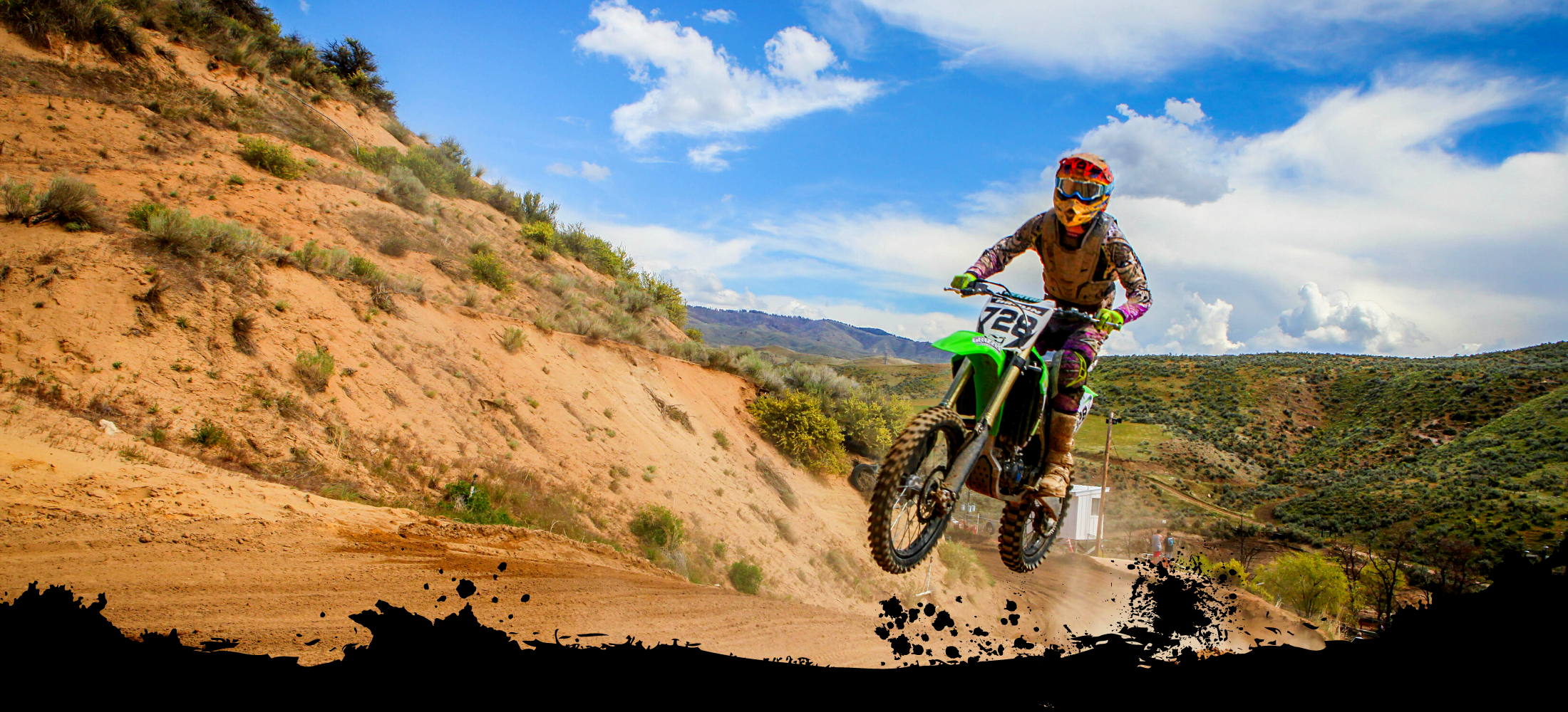
Our image with the splatter frame going horizontally across the bottom
Most of the splatter effects used in this example are free, but a number of them are paid elements, or free with the pro account. You should be able to find enough free elements to be able to create this effect. You can also use unsplash.com to find photos which you can then upload to Canva to add on the effects.
If you're using Canva quite often, then the pro account may be suitable for you. Click here to check out Canva's pro account pricing.
Creating the splatter frame effect vertically
Duplicate the design you just created above, and then we're going to create the frame coming down the side of the photo instead of along the bottom. You can do both if you wish, but in this example, we're just showing the framing on the left side of the photo. If you've followed the tutorial up to this point, you can just reuse the assets you've already used for the bottom edge frame and rotate and manipulate these to frame the side of the photo.
Play around with the splatters until you get the desired effect you're looking for. Try not to use too many layers because the more layers you use, the speed of the Canva software, because it's based in Google Chrome, we become limited by the abilities of our browser as opposed to dedicated software. It's important to consider removing elements that aren't needed to help speed things up.
Once you have a straight edge of your frame going vertically (or at an angle from top to bottom), all that's left to do is fill in the space to the left of the image. To do this, use search for a shape like a rectangle from Canva's elements section and stretch and angle it to fill the gaps to the left of the image. Make sure to make the color of your square match the color of your frame (in our case, black). It may be helpful to enlarge the image which you have framed on one side as there's more space when we're not framing the bottom as well to include more detail of the hero in our photo.
Once we have created this frame, we can search for another image to put in our frame and recreate the effect using other photos. Insert another image into the frame and enlarge it to fill the gap. Then click 'send to back' so that the frame comes to the front. If your previous image was the background of your design, then it won't be visible, but you may need to play around a bit. With our second photo, we can repeat the image editing process with high contrast and dark tones to match the black frame.

JPG or PNG?
Now we should have two images to play with. Download these one at a time as individual images to avoid needing to unzip the files. It's good practice to name your files and you can do this in Canva next to the page number so it's not called 'untitled design'. In the download options, we can use either JPG or PNG. It's a dilemma of which file type to use. If we're using graphics as we have in our frames we would generally lean towards PNG files. If we have photos we would tend to use JPGs because they have better compression for smaller files. The decision on file type is usually a case of trial and error. We're going to download JPGs in this example but we may see some distortion or pixelation on the single color section.
Putting the images into Squarespace
We're using a trial website on Squarespace here, so to add the images we first need to add a section. Under 'Headlines', find a suitable option that matches the style we're looking for (text on the left and a banner photo across the whole width.

Inserting a new headline section
In the settings, under 'Format', set the image to medium height, and then under 'Background', remove the preset image and upload one of the files we created in Canva. Once uploaded, we may need to move the focal point of the image down to the bottom so that we can see the entirety of the splatter frame effect.
To finish up with, under the 'Background' tab, we can add overlay opacity to darken the image so that it fits our branding.
In this example, we are then going to remove the call to action as it doesn't fit what we want to do with this website. This moves our image down so the motocross rider doesn't have a head! If this happens, go back into the settings and click the 3 dots under section height and then use the customization tool to change the section height to one where we can see our entire photo.
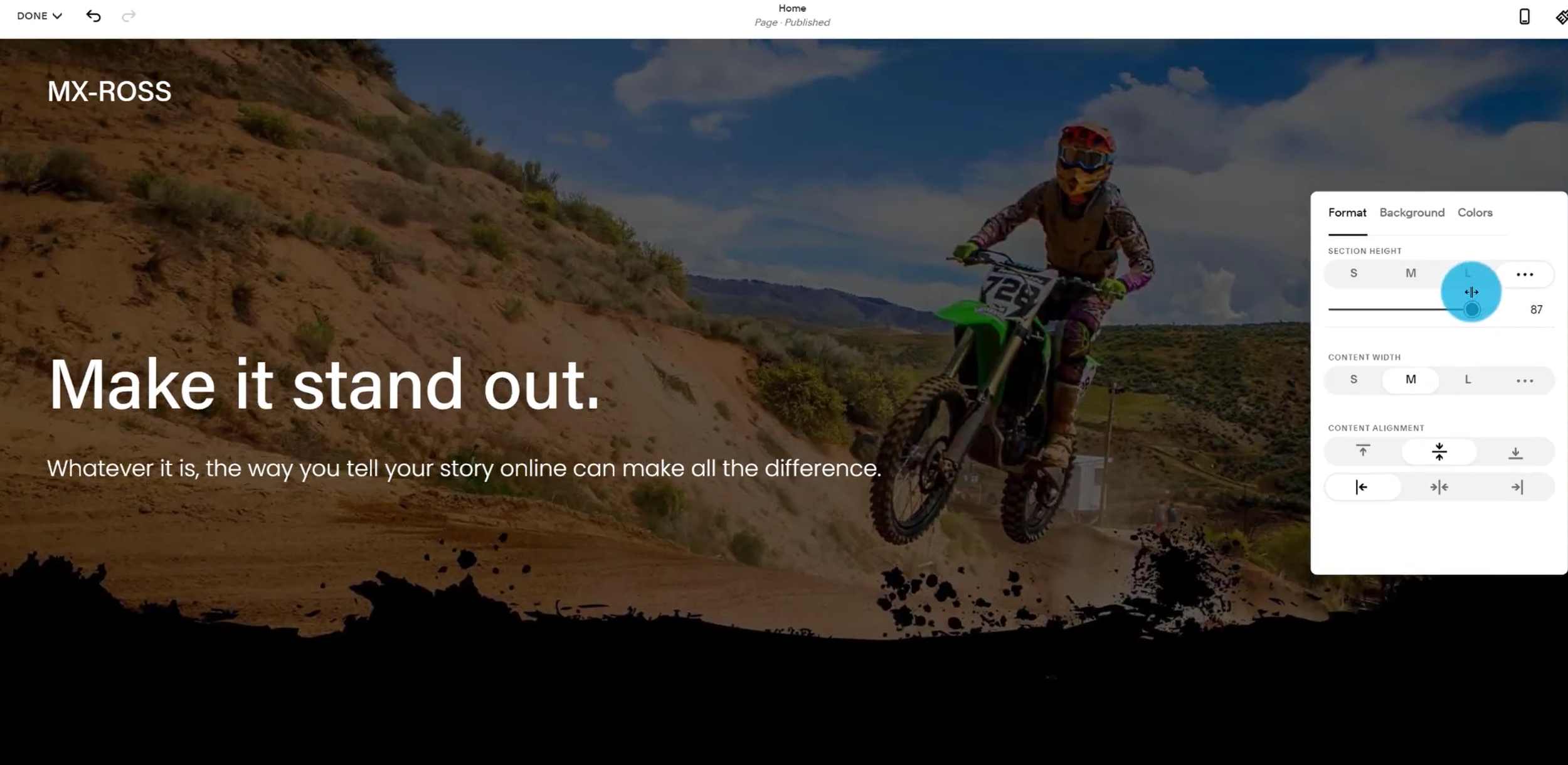
Adjusting the banner height
If you are changing the section height on a subsequent section such as the 'About Us' page, it's worth remembering the number of the section height here to keep it consistent across the banners of all pages or use one of the defaults. For our homepage, we can use a deeper banner image because it's all about the initial first impression when visiting our site.
Adding our second banner image
In order to separate our two banner images, add a quote section underneath the initial masthead banner. Then under this, add a new banner or 'headline' section as Squarespace calls them.
Once again we will remove the stock image and upload our second image. This should give us our left-framed image. Once that's uploaded, we can go back to the format options and reduce the height a bit. Next up, we need to make the text stay towards the left so it doesn't overlay our image. To do this we can either put in a spacer to the right of the text or click on the text and under settings reduce the content width manually so that the text is clearly separate from the image. We can play around with the positioning of the text but center or bottom alignment should do the trick here.
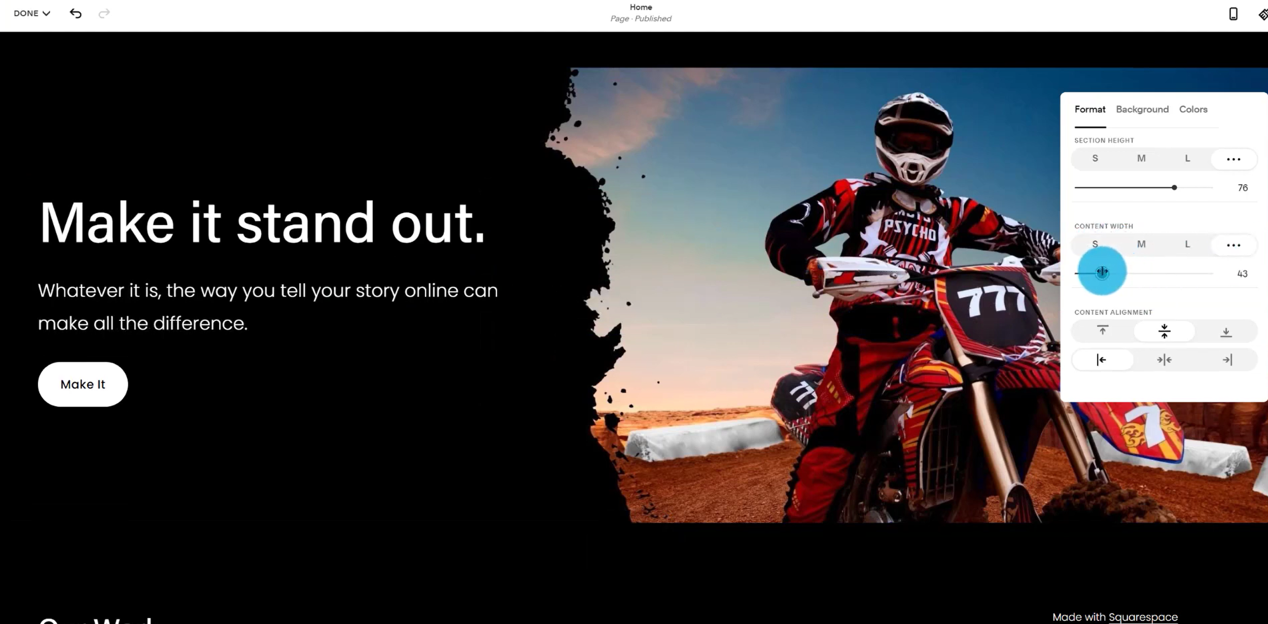
Adjusting the content width
Now we've got two really striking banners working nicely on the site. We could swap the banner images around by hovering over the banner and clicking the up or down arrows next to the settings button. This feature only works in Squarespace 7.1, but the graphics we've created should be able to be used in older versions of Squarespace.
That's it for this chapter, we've covered a lot so it's probably a good idea to have a few run-throughs of this article and the video tutorial to get you comfortable with all the steps.
In chapter four of our Combining Canva with Squarespace course, we're going to learn how to combine background images with floating transparent PNGs.
See you next time!
This post contains affiliate links. When you click on an affiliate link and make a purchase, we may earn a commission.


Vivamus pellentesque vitae neque at vestibulum. Donec efficitur mollis dui vel pharetra.