Combining Canva with Squarespace - Part Six
Welcome to the sixth and final part of the PixelHaze Combining Canva with Squarespace free mini-course. In this chapter, we're going to be looking at the impact of the image effects we've created in previous chapters on mobile layouts and then making the necessary adjustments to ensure our effects smoothly transition between desktop and mobile view.
If you’ve missed any chapters of the course so far, check out the previous parts on the PixelHaze YouTube channel and the free guides on the PixelHaze Academy blog.
Reviewing the content so far in mobile view
Motocross website
Starting off on our motocross website, click the top right-hand corner mobile view button. We can see here that straight away our mud splatter frame effect that we created in part three doesn't quite work looking at the white text overlaying the image on the right-hand side.

The text overlaps the splatter frame in mobile view
Scrolling down, we can see that our splatter effect on the background of our duotone images works well as we'd hoped. Our splatter frame at the bottom of our second motocross picture, although we're only seeing half of it, works well in mobile view. We can modify the focal point by clicking 'edit', going to the 'background' tab, and dragging the circle representing the focal point slightly to the right, making sure we have it locked to the bottom of the image too so we can see the framing effect.
Greening and Co
Heading to our Greening and Co template, we can check out the floating transparent PNG image that we created in part four. We created this design with mobile view considered so it looks great.
On our homepage, we can see that our hero banner unit created in part two needs some work as our hero unit is cutting out both of our characters. We're going to need to focus on one of the two people in the image.
For the Greening and Co hero banner unit, click on edit on the banner and click ‘background’. From there, we can choose the focal point to be somewhere slightly to the right so that we are framing our hero in the foreground. Save the changes and switch to mobile view. Now we can see our hero is in the frame which looks much better, but we do still have text overlaying the hero's face.

In mobile view neither of our heroes are in focus

By changing the focal point, it looks a lot cleaner
To improve this design further, we could consider adding a media query into this website so that we hide the extra text block which would bring the headline down and make the design look less text-heavy. This would only be suitable if the text block contained optional information that is not essential for mobile devices.
To achieve this, in the Squarespace menu on the left, go into 'Design', 'Custom CSS' and use a text expander tool to add in a media query. If a media query is a new concept to you, put simply, it's an instruction to say 'only make these changes on mobile view'. This is a more advanced option, so don't worry if it doesn't make much sense to you. But essentially you can Google media queries and look at examples of code that can be used and then copy and paste into the custom CSS box.
The code we are using is is saying, 'make these changes for all devices up to a maximum width of 600 pixels' which covers mobile devices.
Next up, we will use a chrome extension called Squarespace block identifier to help us target the paragraph text within the text block. Copy the block code and paste it into the custom CSS box, in between the curly brackets. Then put a 'p' at the end (for paragraph), type display: none. This will remove the text but only on devices up to 600 pixels in width, so it will still be visible on desktop view.
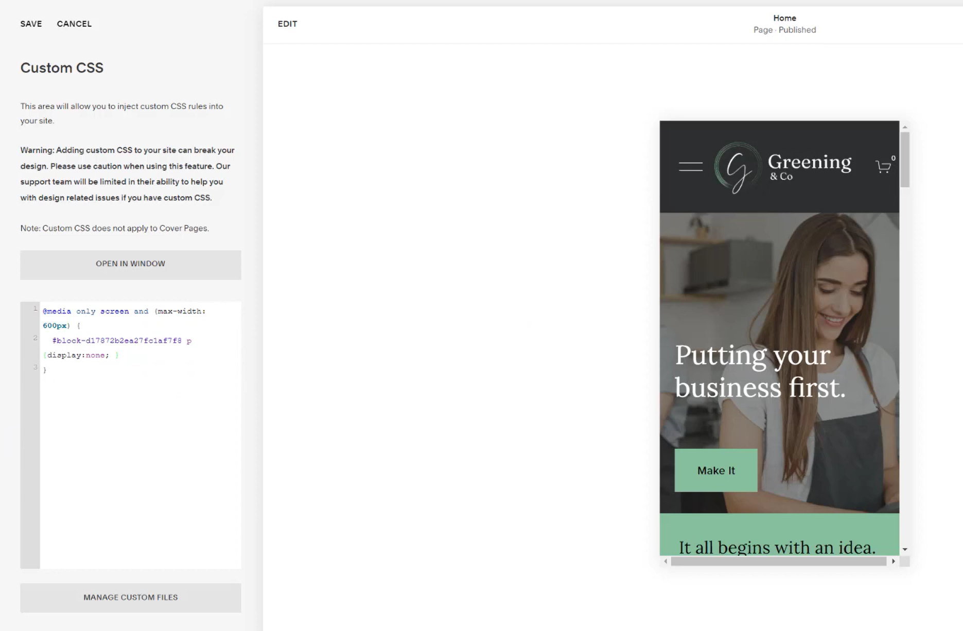
The media query removes the extra text on mobile view but retains it on desktop view
Custom CSS can be confusing for beginners, so if you're feeling really out of your depth, ask for help from our PixelHaze team, or Google some custom CSS you can use. For experts in this field, it won't take them long at all! If you're inquisitive and you want to find out more about how to use CSS to get the most from your Squarespace website, then play away!
Adjustments to our motocross website designs
Heading to our motocross website, instead of removing the text on mobile view, in this example, we want to change the text position and size on mobile view so it doesn't overlay our frame. We can again do this using custom CSS.
Use the block identifier to find the code referring to the text block and copy it to the clipboard. Head to the design and custom CSS tabs through the menu on the left-hand side. In this case, we already have a media query in place. Paste in the block code, and add in h1 to refer to heading 1, and then copy and paste this onto a new line, changing h1 to p for paragraph. Add in curly brackets after h1 and p {} in which we will add in our instruction.
Change to mobile view so that we can see the impact of our code instantly on our design. Our instruction in this case is going to refer to the text size, so after h1 inside the curly brackets type {font-size 1.6em}. We tried 1.4 and 1.5 font size which could also have worked but this was the best option. Then we can apply the same effect to the paragraph text, by copying and pasting the font size code and reducing the size - in this example to 1em.
We are then going to give a second instruction to stop the text from overlapping the frame. To do this add a semi-colon (still inside the curly brackets) and then type max-width: 60%. And there we have it!

Using custom CSS to make sure the text does not overlap our splatter frame
To check our code works, toggle the preview between desktop and mobile view and we should see the text staying to the left-hand side of our mud splatter frame on mobile view.
The only other thing we may want to change on this design to optimize for mobile is to potentially move the position of our motocross rider so he is closer to the frame. This would require going back into Canva and redownloading and uploading the image to Squarespace, but well worth it if we anticipate most of our users to be accessing the website via mobile.
We have shown two options for mobile optimization of text here - firstly, removing the non-essential text and secondly, reducing the text size and altering the maximum width.
Adding an image overlay
The last option we’re going to show for mobile optimization is adding an image overlay. In this example, we created a square mud splatter frame, as we did in part three of the course on Canva. The aim here will be to put the text in a splatter effect frame.
Once we've created the square mud splatter, download it as a PNG with a transparent background so it's ready to be uploaded to Squarespace. In the meantime, head back to Squarespace and set the content width to small or drag the content width bar down further so the text won't come across the page too far.
Click on the plus below the text block and add an image block. Upload the image we created in Canva. Once uploaded, click the 'design' tab in the image settings and choose 'poster' instead of 'inline'. This now puts the text inside the image. We then can change the text size, alignment and even add a call to action button in this image block (under the 'content' tab). We can even add an animation to the image block which will be played as we're scrolling down the page (under the 'design' tab).
Creating the image overlay in Canva, similarly to how we created our mud splatter frames in part three

Applying the image overlay in Squarespace
The final thing to sort out here is to remove the old text block, which should sort out any distortion or zoom issues. Another option to help with any distortion is to set the content width to small or drag the scale option down further than the default small and also change the section height to medium or even a little smaller.
We can now drag our browser window smaller and larger in width to see how the text and image block moves. We would need to use some custom CSS code to stop the text from moving outside of the frame. For example, reducing the text size for screen widths of up to, say 1200 pixels. This modification may require a little more tinkering than the others. But when we take it to mobile view, we can see it works perfectly.
Make sure to save your changes and every time we complete a modification, toggle between both desktop and mobile view to check it has worked. Keep your eyes peeled for potential plugins on the PixelHaze Store which are in development to reduce the need for so much tinkering in the future.
That's all for this chapter! We can see how we can modify the effects we've already created to optimize for a mobile screen.
We hope that you've enjoyed the course and learned a few skills you can now apply to your website design with Squarespace. Thanks for sticking with us and let us know how you get on with applying these Canva graphics to your Squarespace website!
Be sure to check out our full Canva and Squarespace Box of Tricks courses, two fantastic courses which will give you even more skills and tips for further improving your website design. These courses come for FREE with a PixelHaze membership plan, which is only $60 per year!
Sed purus sem, scelerisque ac rhoncus eget, porttitor nec odio. Lorem ipsum dolor sit amet.